

Sincere arguments
ZEIT STIFTUNG BUCERIUS is one of Germany’s largest foundations, and has been a passionate fighter for a healthy democratic society for half a decade. Today more than ever, they create cultural, scientific and journalistic spaces where current tensions can be openly addressed and discussed. This bold position is now reflected in a new brand identity:

××× BREAKING ××× This new brand identity has just been awarded by RED DOT and ADC! See a very short interview here, and find more on the work below ×××

Before & after: the desire for a clear brand architecture led to a reduced name. Emphasizing the founders Ebelin and Gerd's last name BUCERIUS strengthens connection to the many foundations’ projects by that name.
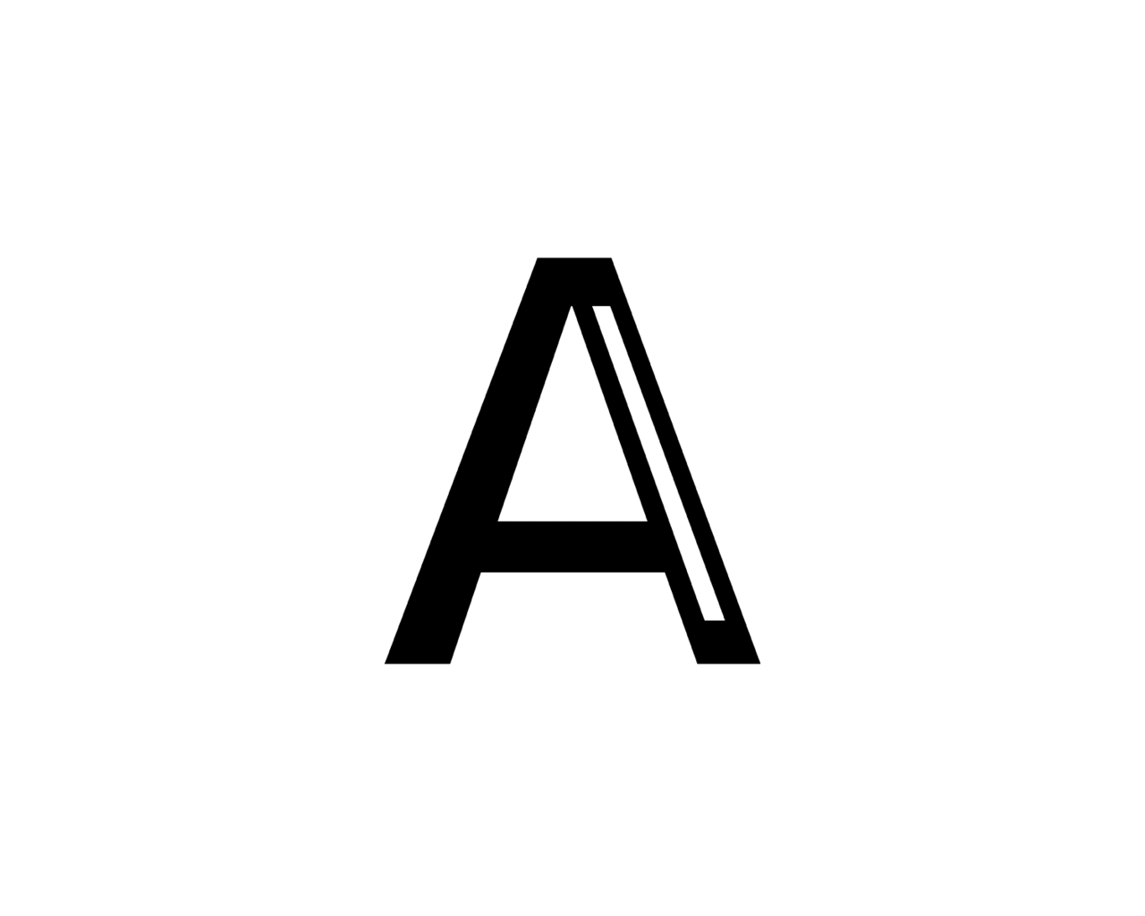
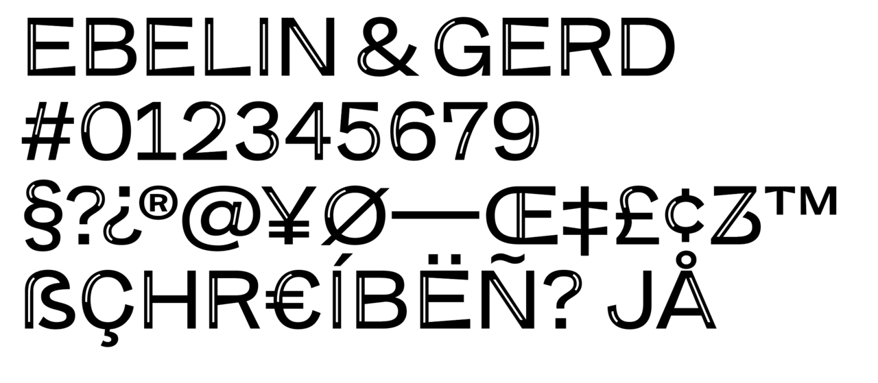
The foundation’s new typeface carries tension and dialogue within itself: BUCERIUS CAPS bridges the gap between grotesque and serif, with its inlay weight referencing the most central of Bucerius publications — Germany’s biggest weekly paper, DIE ZEIT.
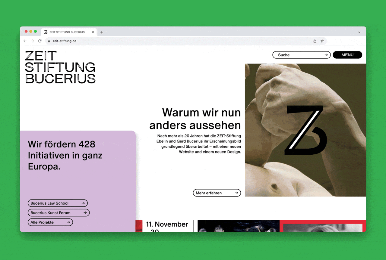
A diverse color palette and ambivalent photography complete the new look, taking a stance for nuanced conversations in heated times. All of it is in the works at ZEIT STIFTUNG BUCERIUS!


Partner: ZEIT STIFTUNG BUCERIUS / since 2022
Creative Direction: Jon Hoekstra / Strategy: Eva Müller, Max Kowalewski
Project Management: Anne Jugert, Flora Hamer, Lino Chlistalla
Art Direction: Anna Hoekstra, Celia Marchena, Esther Grünewald
Typographer: Jan Henrik Arnold / Animation: Dorian Hehn